Descriptive statistics analysis using climate data
Climate is a complex system that is affected by a variety of factors, including atmospheric composition, solar radiation, and ocean currents. Understanding the Earth’s climate is essential for predicting future changes and developing strategies to mitigate the impacts of climate change. One important tool for understanding the Earth’s climate is statistical descriptive analysis, which is a set of techniques used to summarize, describe and make sense of large sets of data. These techniques help to identify patterns, trends and relationships in data, which can be used to understand how the climate is changing over time.
Introduction
Climate data is collected from a variety of sources, including weather stations, satellites, and climate models. Each of these sources has its own strengths and limitations, and scientists use a combination of data from multiple sources to get a comprehensive understanding of the Earth’s climate system. Weather stations, for example, provide detailed information about temperature, precipitation, and other weather conditions at specific locations. Satellites, on the other hand, provide global coverage of the Earth’s surface and can measure a wide range of climate variables, including temperature, precipitation, and atmospheric composition. Climate models are computer simulations that are used to understand how the Earth’s climate system works.
Scientists must use a variety of statistical techniques to make sense of the data. One important technique is data cleaning, which is the process of removing errors and inconsistencies from the data. After the data is cleaned, statistical descriptive analysis techniques can be used to summarize and describe the data. Examples of these techniques include mean, median, and standard deviation, which help to identify patterns and trends in climate data over time. Another technique used in statistical descriptive analysis is correlation and regression analysis, which is used to understand the relationship between two or more variables. Data visualization is another important technique, which is the process of creating visual representations of data to make it more understandable and accessible.
In this blog post, we will explore some common descriptive statistics methods and how we can utilize a new technology/tools to do the analysis in more detail and give examples of how the output could be used to understand the Earth’s climate system. We will also discuss the limitations and potential sources of error of these techniques and the importance of continued research and monitoring of the Earth’s climate to improve our understanding of the complex interactions between the atmosphere, oceans, and land surface.
Descriptive statistics can be broken down into the following categories:
- Frequency distribution is a method of counting how many times a specific aspect appears in a data set. This information is recorded in a table format and is useful for analyzing both qualitative and quantitative data.
- Central Tendency, includes three calculations: Mean, Median, Mode. These results represent the central value of the data set, providing a summary of the total number of occurrences.
- Variability, it describes how far apart the data points are from each other. It shows the range of dispersion and the degree of variance in the sample, from the highest to the lowest value.
Below are measures of central tendency and variability, respectively, used in descriptive statistics to summarize and describe a set of numerical data.
min(minimum value) is the smallest value in a dataset. It provides an idea of the lower limit of the data. It can be represented as the equation: \[\min = \min(x)\] where \(x\) is the set of data.mean(average) is the sum of all values in the dataset divided by the number of data points. It provides an estimate of the central tendency of the data, but can be skewed by outliers. It can be represented as the equation: \[\bar{x} = \frac{\sum x}{n}\] where \(x\) is the set of data and \(n\) is the number of data points in the set.medianis the value in the middle of a dataset when it is sorted in ascending or descending order. It provides a measure of the central tendency of the data, and is not affected by outliers. It can be represented as the equation: \[\text{median} = x_{[n/2]}\] where \(x\) is the sorted set of data and \(n\) is the number of data points in the set. If \(n\) is even, then the median is the average of the two middle values.modeis the value that occurs most frequently in a dataset. It is useful in finding the most common value in a dataset, but it doesn’t provide much insight into the spread or distribution of the data. It can be represented as the equation: \[\text{mode} = \max(f_i)\] where \(f_i\) is the frequency of each value in the set of data \(x\).max(maximum value) is the largest value in a dataset. It provides an idea of the upper limit of the data. It can be represented as the equation: \[\max = \max(x)\] where \(x\) is the set of data.rangeis the difference between the maximum and minimum value in a dataset. It gives an idea of the spread of the data. It can be represented as the equation: \[\text{range} = \max(x) - \min(x)\] where \(x\) is the set of data.stdev(standard deviation) is a measure of the spread of a dataset. It quantifies how much each value deviates from the mean. A low standard deviation means the values are clustered closely around the mean, while a high standard deviation indicates that the values are more spread out. It can be represented as the equation: \[s = \sqrt{\frac{\sum(x_i - \bar{x})^2}{n}}\] where \(x\) is the set of data, \(\bar{x}\) is the mean of the data, and \(n\) is the number of data points in the set.
Data and Tools
The analysis utilizes data from NASA GLDAS-2.1 which is accessible from Google Earth Engine (GEE) Data Catalog. The model was initiated on January 1, 2000 and was based on the conditions from the previous GLDAS-2.0 model. It utilized atmospheric analysis fields (Derber et al., 1991) from the National Oceanic and Atmospheric Administration’s Global Data Assimilation System (NOAA/GDAS), precipitation data from the Global Precipitation Climatology Project (GPCP), and radiation fields from the Air Force Weather Agency’s AGRicultural METeorological modeling system (AGRMET) starting from March 1, 2001.
The analysis utilizes a free geospatial cloud computing platform GEE to do the computation and visualize the result. GEE has several advantages such as: fast access, interactive algorithm development with instant access to petabytes of data, and reducing computational challenge (cost on hardware, software license and internet bandwidth) - if the analysis required a lot of earth observation data with large coverage areas to be downloaded and processed.
How-to?
Here is a step-by-step guide for performing a statistical descriptive analysis on GLDAS 2.1 3-hourly data data for the last 10-years, from 2013-2022 using GEE:
Create a configuration setting on:
- Point of Interest, to extract time series information by a coordinate. In this analysis, we would like to extract daily air temperature at below coordinate, which is the location of the Department of Geophysics and Meteorology - IPB.
//--- To extract timeseries information by location var geometry = ee.Geometry.Point([106.73079706340155, -6.557929971767509]);- Data availability checking
//---  Check data availability
var firstImage = ee.Date(ee.List(GLDAS.get('date_range')).get(0));
var latestImage = ee.Date(GLDAS.limit(1, 'system:time_start',  false).first().get('system:time_start'));
Access the GLDAS 2.1 and other boundary data and load the data into a GEE ImageCollection: You can access it using the Earth Engine Data Catalog and then load it into a GEE ImageCollection, which is a collection of images. This will allow you to process and analyze the data in GEE.
//---  Global Land Data Assimilation System Dataset Availability:
var GLDAS = ee.ImageCollection('NASA/GLDAS/V021/NOAH/G025/T3H'); //GLDAS21
// These are USDOS LSIB boundaries simplified for boundary visualization.
var bnd = ee.FeatureCollection("USDOS/LSIB_SIMPLE/2017");
Filter the data based on the required time range: we can define the start and end dat for the analysis..
//---  Start and End date
var startDate = ee.Date('2013-01-01');
var endDate = ee.Date('2023-01-01');
Write a function to convert Kelvin to Celsius
//---  Function to Celsius
function toCelcius(image){
 var Temp = image.select('Tair_f_inst').subtract(273.15);
 var overwrite = true;
 var result = image.addBands(Temp, ['Tair_f_inst'], overwrite);
 return result;
}
//---  GLDAS air temperature in degC
var GLDAS_Tair = GLDAS.select(['Tair_f_inst']).map(toCelcius);
Reduce the data to a single image and perform the descriptive analysis: Use the reduce() function to reduce the ImageCollection to a single image, use the filterDate() function to extract only the data that you need for the analysis, then calculate descriptive statistics, such as mean, median, standard deviation, minimum and maximum values, and others, using the reducers in GEE.
//---  MEAN
var Tair_mean = ee.ImageCollection(
 ee.List.sequence(0, numberOfDays.subtract(1))
   .map(function (dayOffset) {
     var start = startDate.advance(dayOffset, 'days');
     var end = start.advance(1, 'days');
     return GLDAS_Tair
       .filterDate(start, end)
       .mean()
       .rename('Tmean')
       .set('system:index', start.format('YYYY-MM-dd'))
       .set('date', start.format('YYYY-MM-dd'))
       .set('system:time_start', start.millis())
       .set('system:time_end', start.millis());
   })
);
//---  Sorted time
var Tair_mean_sorted = Tair_mean.sort("system:time_start");
Visualize the results: Finally, you can visualize the results of the descriptive analysis using the visualization tools in GEE, such as a map or a chart such as: line plot, box plots, scatter plots, and others.
- Map
//--- Map visualisation Map.addLayer(Tair_mean_sorted.mean(), Tair_vis, '10-years daily Tmean');- Chart
//---  Combine min, mean, median, mode and max into single image collection
var Tair_temp = Tair_min.combine(Tair_mean)
                       .combine(Tair_median)
                       .combine(Tair_max);
var Tair = Tair_temp.sort("system:time_start");
//---  Visualise all variable in single chart
var chartTair =
   ui.Chart.image
     .series({
       imageCollection: Tair,
       region: geometry,
       reducer: ee.Reducer.mean(),
       scale: 27830
     })
     .setSeriesNames(['Tmax', 'Tmean', 'Tmedian', 'Tmin'])
     .setOptions({
         title: 'Daily Air Temperature',
         hAxis: {title: 'Date', titleTextStyle: {italic: false, bold: true}},
         vAxis: {
           title: 'degC',
           titleTextStyle: {italic: false, bold: true}
         },
         lineWidth: 1,
         colors: ['d7191c', 'fdae61', 'abd9e9', '2c7bb6'],
         curveType: 'function'
       });
print(chartTair);
Save the data: Once we have completed the analysis, save the data to a format that can be easily shared with others, this could be a CSV file.
//---  Generate all temperature at single location
var timeSeriesTair = Tair.map(function (image) {
 var mean = image.reduceRegion({
   reducer: ee.Reducer.mean(),
   geometry: geometry,
   scale: image.projection().nominalScale()
 });
 return ee.Feature(null, mean)
   .set({
     'date': image.date().format('yyyy-MM-dd'),
     'system:time_start': image.date().millis()
   });
});
//---  Export all variable to csv
Export.table.toDrive({
 collection: timeSeriesTair,
 description: 'gldas21_ipb_geomet_tair_2013_2022',
 folder: 'GLDAS_csv',
 selectors: ['date', 'Tmin', 'Tmean', 'Tmedian', 'Tmax']
});
Results
In statistical descriptive analysis, we often use measures such as mean, median, and standard deviation to summarize a dataset. For example, the mean temperature can give us an idea of the average temperature in a region, while the standard deviation provides information on how much the temperature values are spread out.
If the temperature data in a tropical region is normally distributed, then we would expect to see a bell-shaped histogram, with most of the temperature values clustered around the mean and a decreasing number of values as we move away from the mean in either direction. In this case, the mean, median, and mode of the temperature data would be approximately equal.
However, if the temperature data in a tropical region is not normally distributed, we might see a histogram that is skewed or has multiple modes. For example, if there are a few extreme temperatures that are much higher or lower than the majority of the temperature values, then the mean temperature would be influenced by these outliers, making it higher or lower than the median temperature. In such cases, the mean may not be a representative summary of the central tendency of the temperature data.
Thus, the choice of summary statistics to describe air temperature data in the tropical region (or any other region) will depend on the distribution of the data and the goals of the analysis.
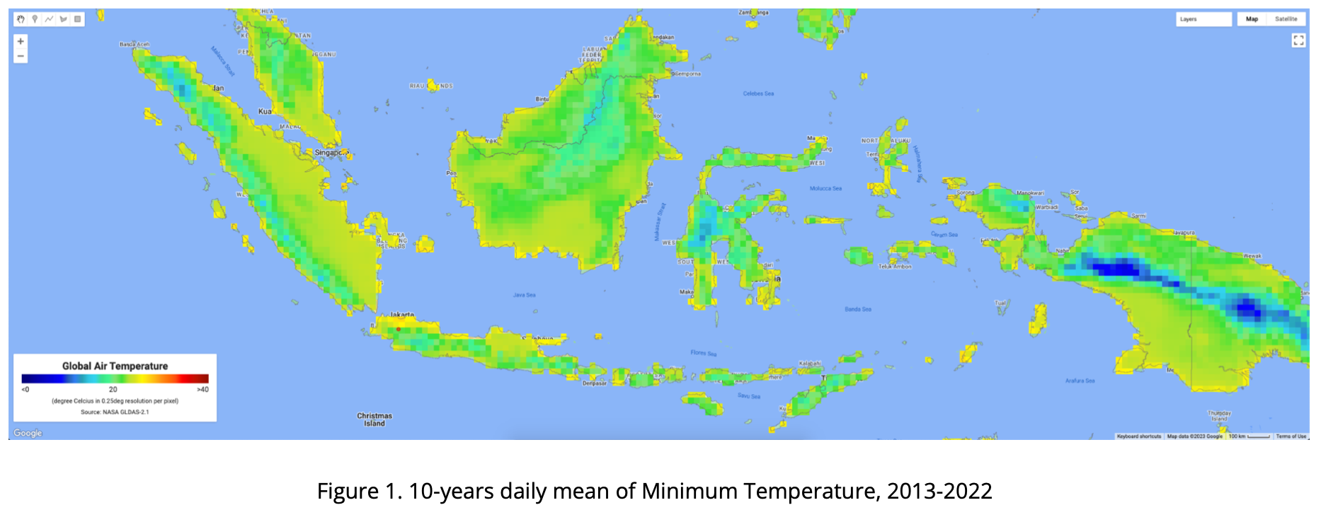
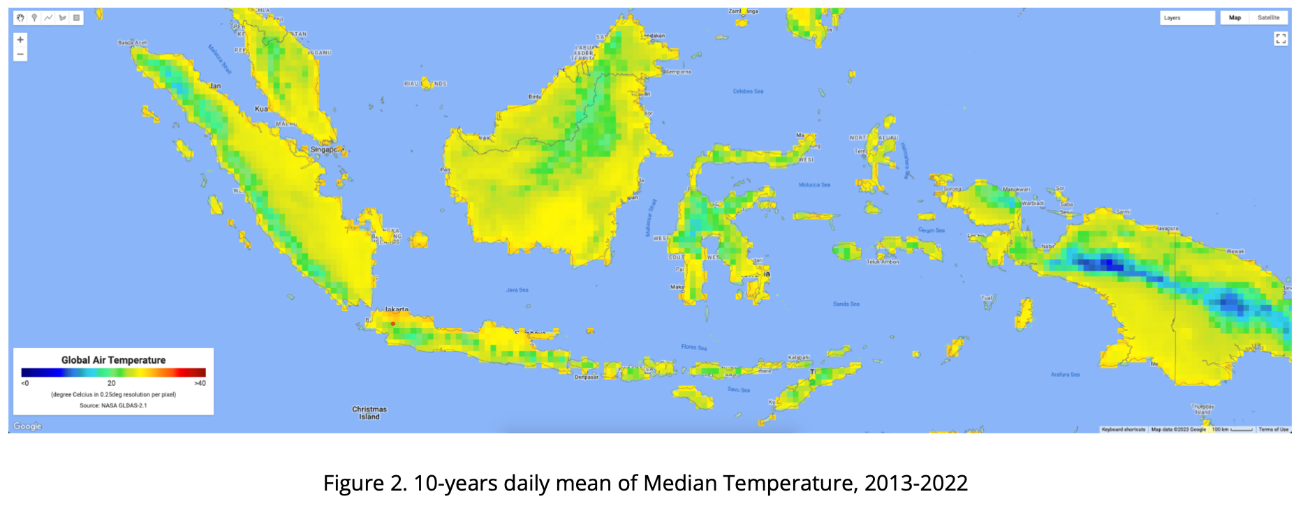
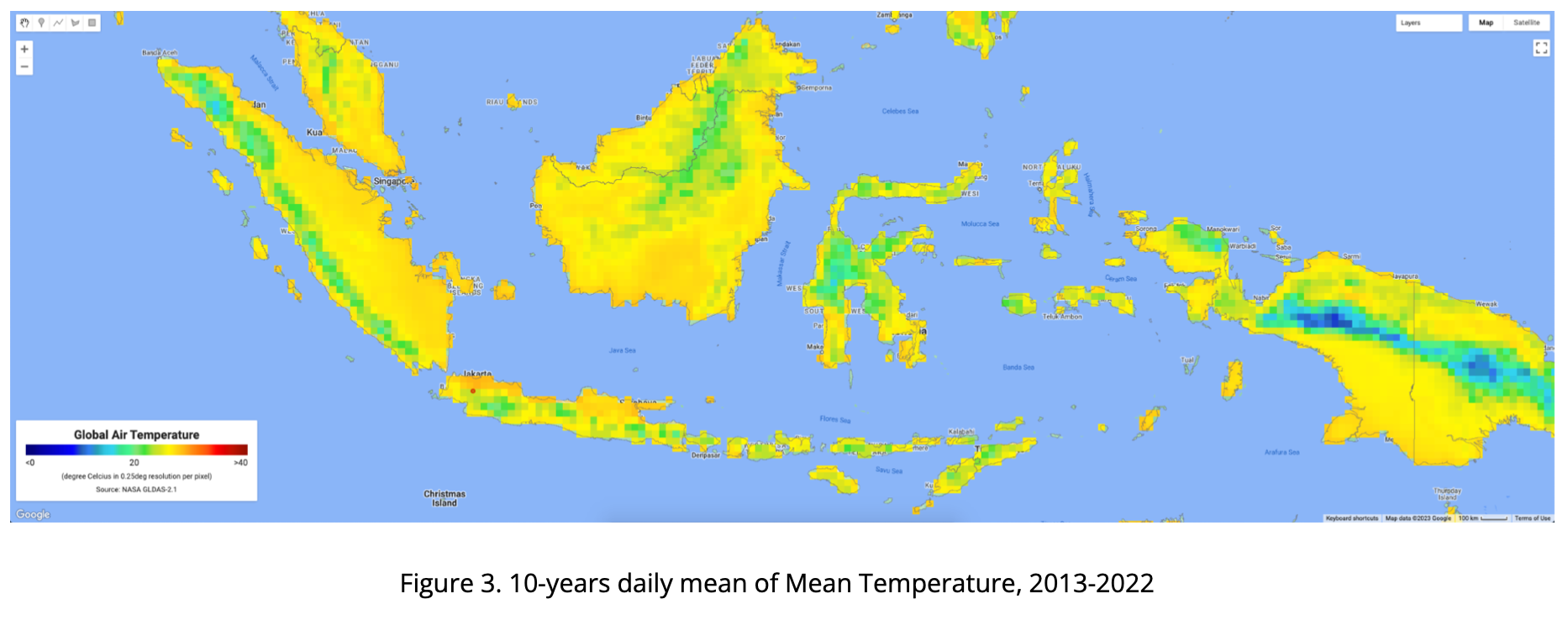
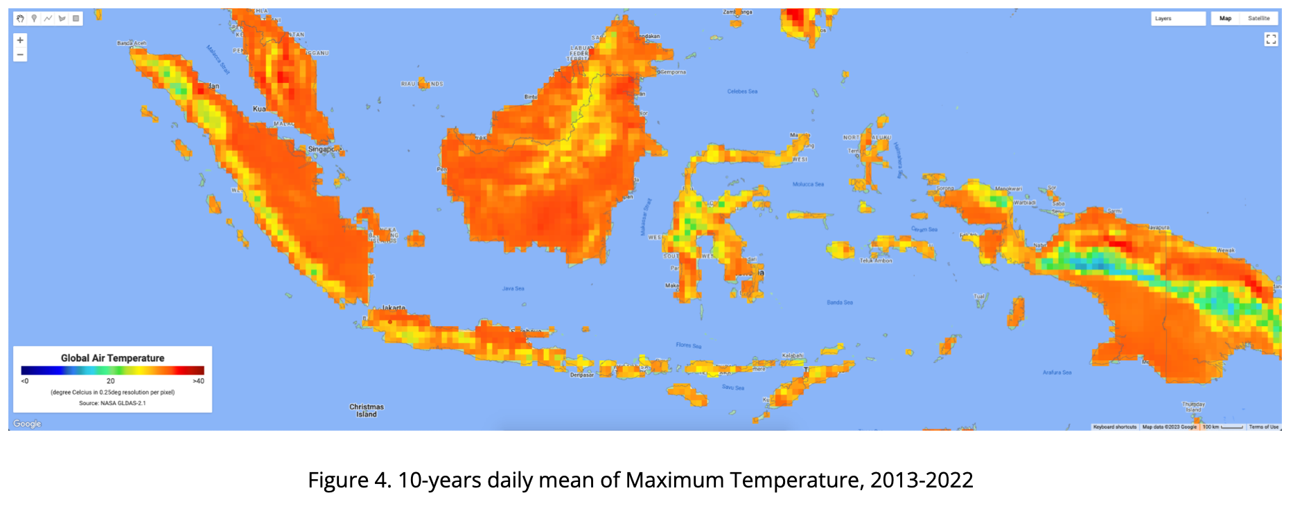
The four maps below consist of the 10-years daily mean of air temperature in Indonesia from 2013-2022, presented as Minimum, Median, Mean and Maximum Temperature. Visualizing using rainbow color, ranging from 0 - 40 degC, from dark blue to dark red.
Using GEE, we are also able to extract based on point (coordinate) location. Below chart is visualizing GLDAS air temperature data extracted from GEE where the point is located at IPB Dramaga Campus in Bogor Indonesia. Red color is daily maximum, orange is daily mean, light blue is daily median and blue is daily min temperature.
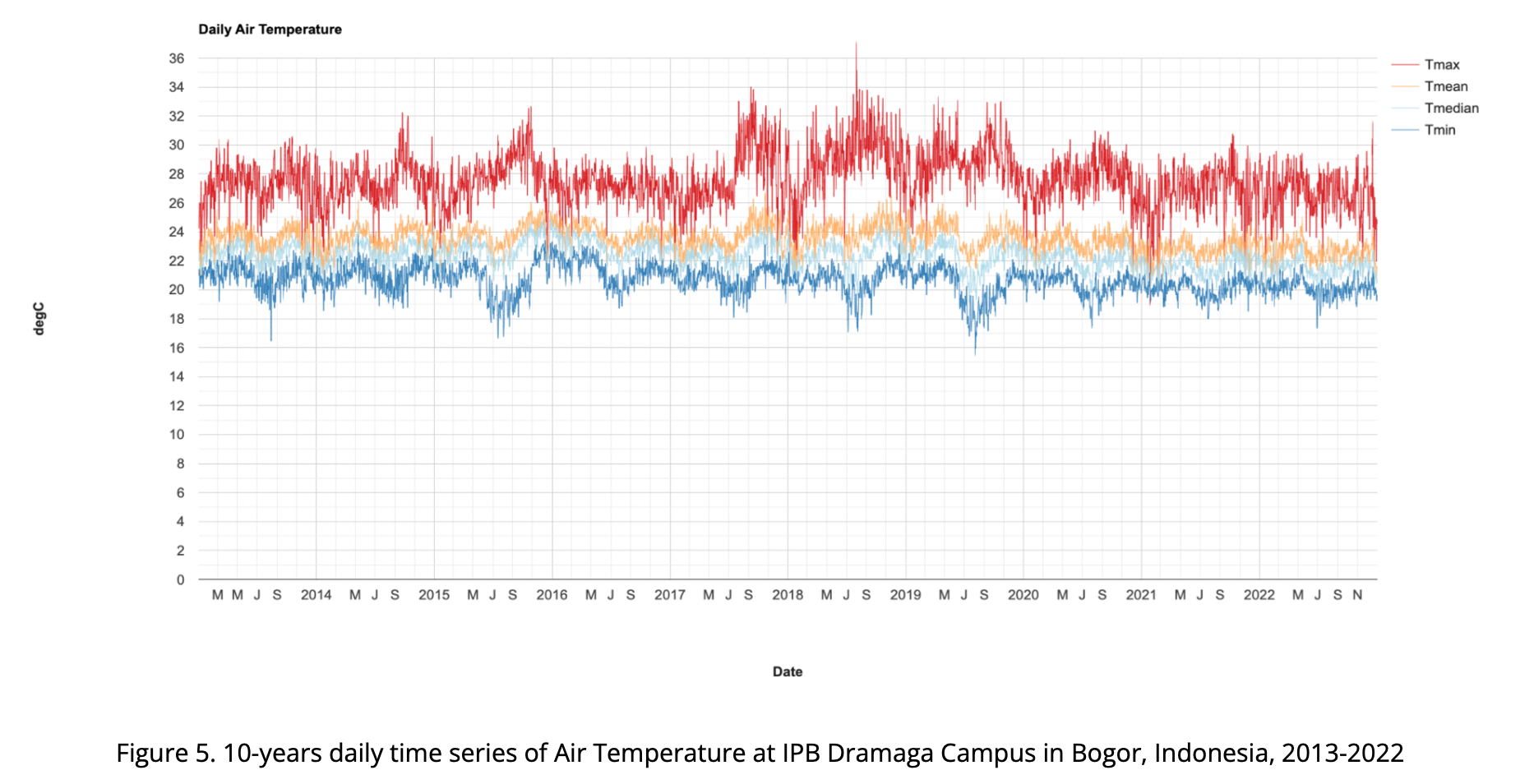
From this data, we can see that the average daily temperature at IPB Dramaga Campus in Bogor is 26.5°C. The median temperature over this time period is 25.0°C. The range of temperatures over this 10 year period is 2°C, and the standard deviation is 1.2°C.
In the 10 year period between 2013-2022, the highest temperature recorded at IPB Dramaga Campus was 34.1°C and the lowest was 19.4°C. The maximum temperature was observed in the months of September and October, while the minimum temperature was observed in the months of July and August. Despite the occasional spikes and dips in the air temperature, generally speaking, the air temperature at IPB Dramaga Campus stays within a relatively narrow range, ranging from 23.4°C to 29.7°C.
Limitation of the analysis
The GLDAS air temperature data is a valuable source for providing insights into the global climate, but it is important to understand the limitations and potential sources of error when performing statistical descriptive analysis. One major limitation of GLDAS data is that it is a data-driven model and its accuracy is affected by the amount of data available. Thus, the GLDAS data may be inaccurate in areas where there is limited data or where the terrain is complex. Additionally, since GLDAS data is based on a simulation, it may contain errors due to the quality of the model and its input data.
The accuracy of GLDAS air temperature data can also be affected by varying temporal and spatial resolutions. GLDAS data is usually provided with a temporal resolution of 3 hours, while weather station data is usually provided with a temporal resolution of 1 hour. This difference in temporal resolution can lead to errors when comparing or combining the two data sets. Similarly, GLDAS data is usually provided.
Similarly, GLDAS data is usually provided in aggregated form over larger spatial scales which can make it difficult to discern local-scale changes in conditions. To address this issue, advanced techniques such as remote sensing and machine learning can be used to interpret the data and develop more localized interpretations. This is particularly useful in areas where detailed records are lacking, or in cases where the data collected is incomplete. Additionally, recent advancements in AI technology have allowed for the development of sophisticated models that can effectively interpret large and complex datasets, providing a more comprehensive understanding of the data.
All content within this report is merely based upon the GLDAS data, without any adjustment or bias correction with station data. As the climate phenomena is a dynamic situation, the current realities may differ from what is depicted in this report. Ground check is necessary to ensure if satellite and field situation data are corresponding.
Code
The GEE code for generate statistical value, maps and the chart are available here: https://code.earthengine.google.com/076b1e65b3d16925bdb088bbb796ede4
Notes: this analysis required a lot of computation resources, all the results especially maps are not instantly available. Please be patient.